In conjunction with Emigre, Virusfonts are proud to announce the launch of a brand new typeface, Priori Acute. Part of the Priori family — which includes Priori Sans and Priori Serif — Priori Acute shares the same common core character as the aforementioned duo, but with radically different styling.
In 2009 our experiments into three-dimensional letter form design led us to the behemoth Hopeless Diamond, now in 2010 the addition of another unfathomable dimension twists the Priori skeleton into the highly unusual display face, Priori Acute.
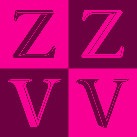
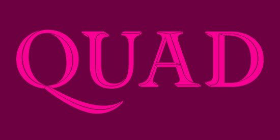
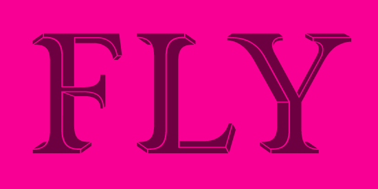
Drawing heavily on the visual contradictions in the work of the Dutch graphic artist M.C. Escher, Priori Acute is a playful exhibit of incongruous perspectives and twisting shapes that fold into themselves tricking the eye to shift the plane. At first glance and at small sizes the effect is subtle and the original letter forms themselves remain intact, retaining the history of British early 20th century typography, which was an inspiration for the original Priori family. But when blown up, the individual Priori Acute characters become beautifully animated and work well in selective situations such as initial caps, short headlines or logo design. Priori Acute is available to buy through Emigre.