This month we are launching a set of six font packages: combinations of like-minded fonts which quite simply means more bang for your buck.
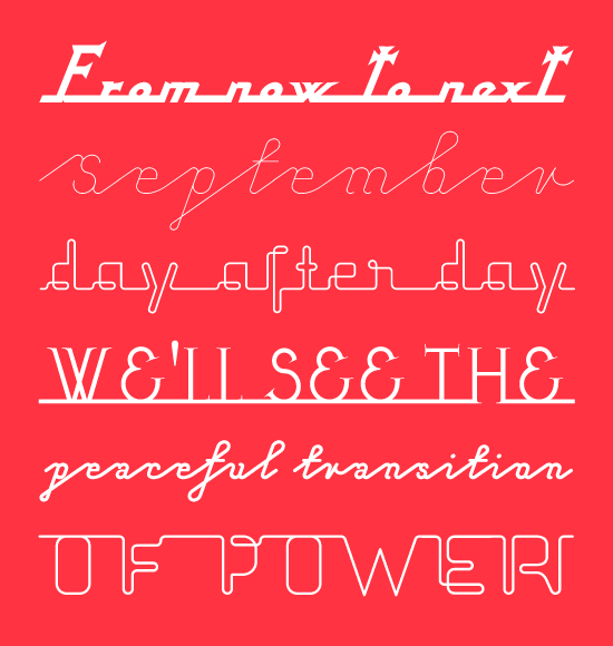
The first package, Cynical Scripts, contains Echelon, Nixon Script and Sarcastic; superb for some sardonic statements.
Some information about the fonts in Cynical Scripts:
Echelon is a font based on eastern Europe 70s ‘pipe-style’ typefaces, Echelon is named after the massive government surveillance system, which listens to our every move.
Nixon Script is very loosely based on a piece of lettering on the front of a 1960s camera. It quickly developed from the retro script to something which had the spirit of the ‘American dream’ and a pious religious feel.
Sarcastic is based on some of the 1950s script display fonts and the rhythmic forms created from the connecting points of neon lettering, re-interpreted in a contemporary style.
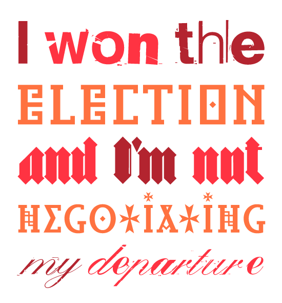
Package number two, Hostile Encounters, includes Bastard, False Idol and Infidel; vital for vitriolic vociferation..
Some information about the fonts in Hostile Encounters:
Bastard is a blackletter font drawn with a contemporary eye. Historic forms have been reinterpreted using a set of modular parts and a new aesthetic appropriate to the contemporary technology it was produced on. In recent history these kinds of letterforms have been identified with the Nazis but blackletter type has been central to the development of typography for over five hundred years.
False Idol is based on bad rubdown lettering from 1970s pornographic magazines and home-made religious leaflets distributed in central London. The letterforms it was based were trying to mimic a feeling of ‘glamour’ but succeeded in just looking seedy. Somehow that seediness is kind of beautiful and has made it one of our most popular fonts.
Infidel is based on letters from the Lindisfarne Gospels and other similar manuscripts and bibles from the middle ages. These wonderfully idiosyncratic forms, some beautiful, some ugly are so far away from what we recognise as legible letters today. The name In?del is intentionally confrontational. The typeface was designed as a response to September 11th contrasting these serene, religious, historic forms with the surge in negative energy that pervaded people’s attitude towards religion.
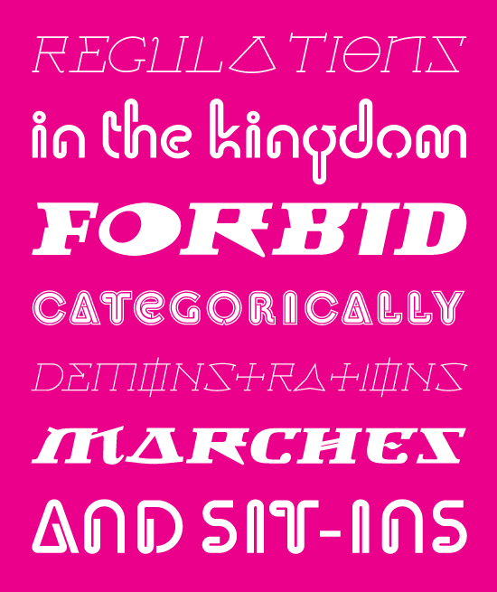
Lucky number three, it’s the Orwellian Nightmare package, including Doublethink and Newspeak; delightful for designing your dreadful dreams.
Some information about the fonts in Orwellian Nightmare:
Doublethink was originally drawn in the 1960s in Yugoslavia as a logo for the shopfronts of the state-owned clothes company Standard Konfekcija by Vinko Ozic-Pajic. The experimental design was reinterpreted with the construction of a two weight typeface – Doublethink Medium and Doublethink Bold Inline. The name Doublethink comes from the book 1984 by George Orwell. It means “the power of holding two contradictory beliefs, simultaneously, in one’s mind and accepting both of them.” An appropriate name for a font produced in a Communist regime.
Newspeak is based on architectural forms from Stalinist Russia and the Cyrillic alphabet, letterforms which show a decadent visual language with a sinister political undertone. The name Newspeak comes from the novel 1984 by George Orwell. Newspeak is a language invented so that people cannot express themselves or think in a way outside the political doctrine enforced by the dictatorship in power.
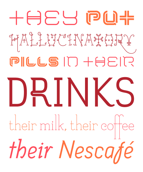
Farcical yet flamboyant, it’s package number four: Psychosomatic Fantastic. Including three complete fonts: Coma, Melancholia and Tourette; it’s unbelievably appropriate for any unconscious utterance.
Some information about the fonts in Psychosomatic Fantastic:
Coma was originally designed to be used with Japanese alphabets, the font is based on a square so that it can be easily used horizontally or vertically. However its sleek, modern feel means that it stands up very well to being used in a number of different ways.
Melancholia is a delicate & usable sans serif font featuring an alternative font with swash style characters normally only used In calligraphy. The italic in melancholia is not a redrawn sloped version of the sans roman, but a sans based on ‘original italics’ such as Garamond. Altogether it makes up a subtle and beautiful typeface.
Tourette is a whimsical and delicate font, based on light slab serif letterforms from the 18th and 19th century and available in two versions, ‘normal’ and ‘extreme’. ‘Normal’ is a delicate but legible font. ‘Extreme’ is full of little flourishes which will give your designs an exquisite, but slightly frivolous feel.
Fabulous number five, it’s the Super Future package including Delux, Prototype and Prozac; superb for some stylish sloganeering.
Some information about the fonts in Super Future:
Delux is a retro-futuristic font available in plain and ultra to satisfy your every desire. The drawing and construction are very simple, almost naïve, inspired by type found on old military aircraft and redrawn with a contemporary voice. Delux is one of our most well known and popular fonts.
Prototype is a universal alphabet with a very contemporary identity crisis – is it old or new? uppercase or lowercase? serif or sans serif? Experimental letterforms but with an irritating familiarity of a cover version of a played-to-death pop song. Prototype tries to be all things to all people.
Prozac was an experiment to make a universal alphabet with as few shapes as possible. After much work we managed to generate the whole font using just six shapes which are flipped or rotated. The name Prozac comes from the aesthetic of the font. It looks like it was designed by scientists in a ‘utopian’ genetically engineered society. We also wanted to hint at the relationship between simplifying letterforms and the complexity of meaning conveyed through words.
Like a sick sojourn, it’s package number six: War Tourism. Featuring the fonts Patriot, State Machine and Shock and Awe, it’s the perfect package for that peaceful proclamation.
Some information about the fonts in War Tourism:
Patriot is the sans version of our very popular font Exocet released through Emigre. This font is of course also based on early greek and roman stone carving. However without the serifs and some redrawing its looks a little bit more modern and a little bit more mechanical.
State Machine is based on lettering used on Russian and American military vehicles in the Cold War, additionally in the lower case some more naïve characters have been included which are taken from hand-made political banners from the 1970s. Altogether it makes it one of Virus’s most usable and bold fonts.
The Shock and Awe series was created to release fonts of special historical and political significance. This package contains 2 fonts – the first is a full font based on the nose cone lettering of ‘Enola Gay’, the b-29 aeroplane that dropped the first atomic bomb on Hiroshima in 1945. The second is from the lettering on the Tomahawk cruise missile. Although controversial we hope that this release will create discussion amongst the design community about the context and significance of letterforms.
To find out about VirusFonts news and promotions, please sign up for our newsletter.
Quote Sources for graphics:
Cynical Scripts = Hosni Mubarak
Hostile Encounters = Laurent Gbagbo
Orwellian Nightmare = Saudi Interior Ministry
Psychosomatic Fantastic = Muammar Gaddafi
Super Future = Design Observer: Lost In the Supermarket
War Tourism = Banned Israel Tourism advert