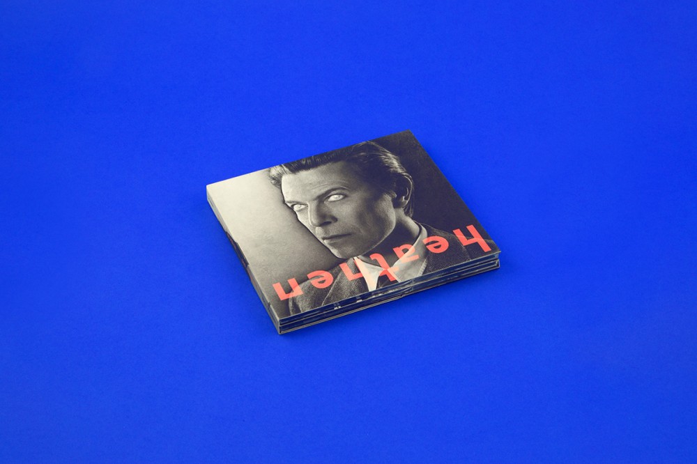
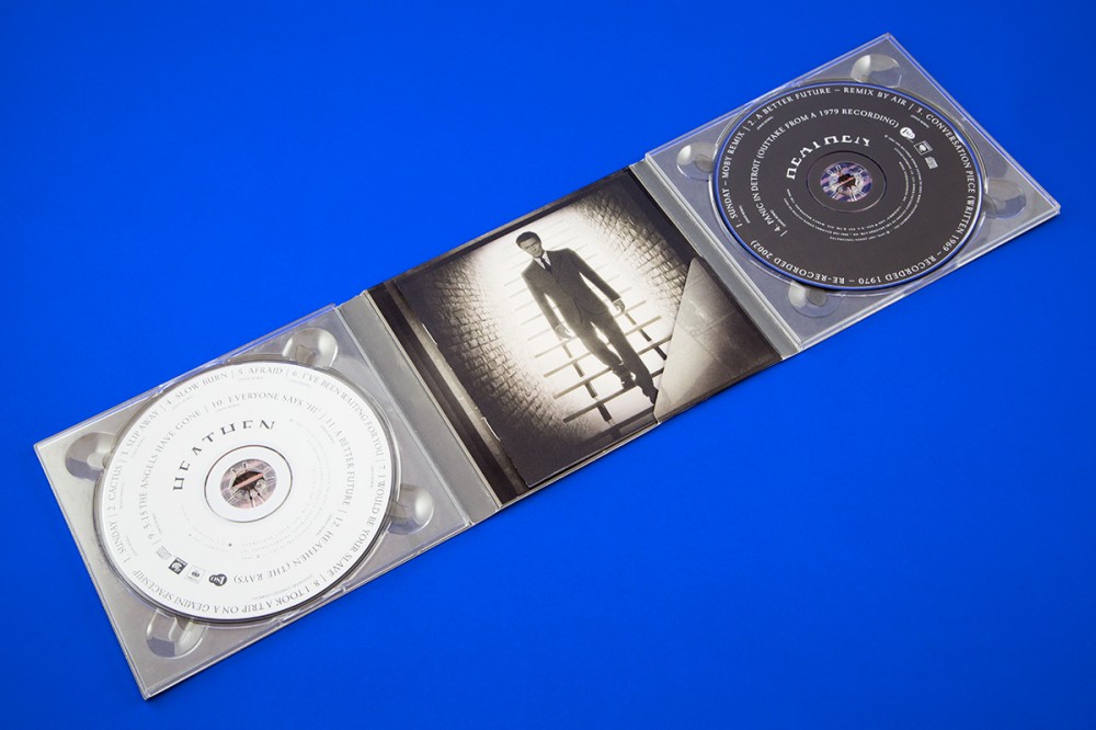
Barnbrook is one of Britain’s most well-known and highly regarded independent creative studios, based in London. We work with a variety of clients across the globe and projects of varying scales. From overseeing the brand identity and environmental graphics of Art Basel and Roppongi Hills to our much-discussed David Bowie album covers.
Barnbrook’s contribution to design was recognised with a retrospective at the Design Museum in London entitled Friendly Fire in 2007 and at Ginza Graphic Gallery in 2004. A touring exhibition if the studio’s work Collateral Damage was staged in various countries, including France, Croatia and Slovenia.
Jonathan Barnbrook is available for teaching and lecturing worldwide.
Awards
59th Annual Grammy Awards – Winner of Best Recording Package for Blackstar, 2016
The Design Museum Beazley Design of The Year – Winner of Graphic Design of the Year for Blackstar, 2016
And many more…
Internships
We do not offer internships as we work from home.
Contact
Unit 1
37 Bavaria Road
London N19 4EU
United Kingdom
General & business enquiries
us(at)barnbrook.net